It’s Easy and Effective to Make Digital Forms
What do logging into websites, buying stuff online, and completing surveys have in common? All of these actions involve customers filling in online forms. Nowadays, there are hundreds of online forms and there are tons of free tools to help people make digital forms.
Is it hard to build forms?
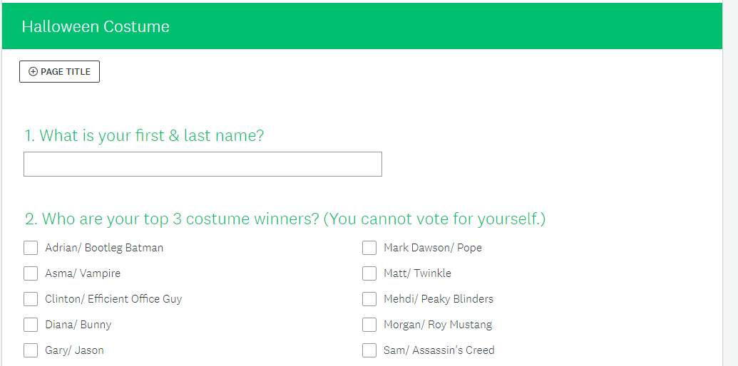
Not at all! One of the great things about digital forms is that it’s easy to learn how to make digital forms. For example, when I was in school, a lot of my classmates learned and used SurveyMonkey.
SurveyMonkey is a free online tool where users make and share surveys. It was a great tool for school (and even work!) because it was easy to build a form and it was valuable for collecting research data.
How do you make a killer form?
Tools like SurveyMonkey are just the beginning. Although it’s not hard to make digital forms, it’s important to learn how to do them properly. After all, great forms lead to great results!
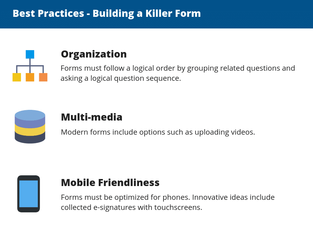
The Best Practices of a Killer Form include Organization, Multimedia, and Mobile-Friendliness.
Organization
Forms must be organized. For example, consider Tax Forms. Taxpayers usually confirm their name, address, and other personal info on the first page of their Tax Form because it makes sense to keep similar data together.
Hence, before people start making forms, they should create a form outline. This involves brainstorming data collection objectives and grouping those objectives in a logical order.
Multimedia
Another best practice is including multimedia. Particularly, people are getting away from text-only forms. Most forms in the 2000s era consist of text boxes and checkboxes. In contrast, modern forms include file uploads.
To illustrate, think about driver maintenance forms. In the 2000s, drivers would need to describe vehicle problems in words. However, in modern forms, drivers can take a video with their phone and upload that video onto the form. After all, pictures are worth 1000 words!
Mobile Friendliness
Lastly, forms must be mobile friendly. Mobile friendliness is much more than downsizing a form to fit a phone screen. Instead, mobile friendliness is about taking advantage of phones. For example, a lot of digital phones use e-signatures. Customers can directly sign on a phone rather than signing on paper.
Case Example: AAA
Many businesses choose to make digital forms because it’s an effective way to improve processes. One of those businesses is AAA, one of the largest emergency road services.
Before starting digital forms, drivers manually completed forms. “Manual forms are a lot of work for drivers and for administrators,” commented a driver. “Sometimes, drivers had to turn in damaged forms because it was raining.”
Then, AAA decided to go digital. Digital forms were much more effective. In fact, on average, drivers got to their next jobs 3 minutes quicker. As a whole, this means AAA saved 750 hours every month!
Click here to learn more about making digital forms with ProntoForms.


